Circe
REFRESHING CIRCE’S BRAND
Helping a brand find its voice, and tell its story to the market was a challenge we welcomed when partnering with CIRCE.
CIRCE is a local brand we now know and love but it didn’t start that way… I mean to be fair we always WOULD have loved them, had we ever met them. But CIRCE was one of those brands that we literally walked past regularly and never engaged with… why? Largely because their name didn’t speak to what they did. Their look + feel didn’t align with their offering with their target consumer.
TODAY, IT’S QUITE A DIFFERENT STORY
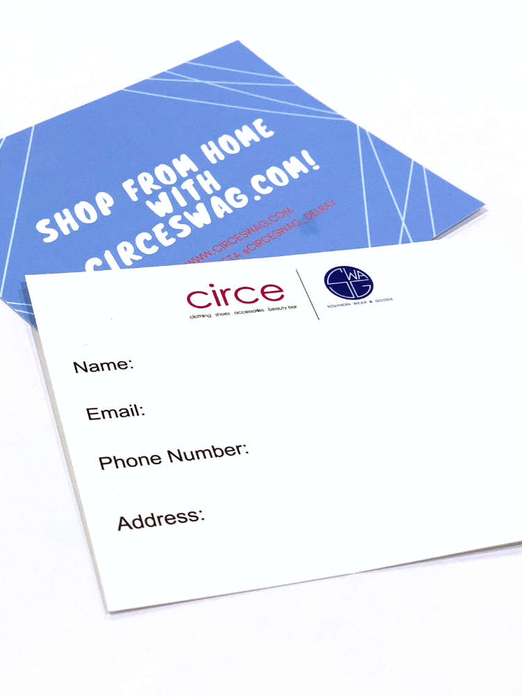
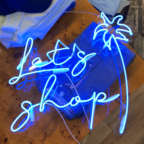
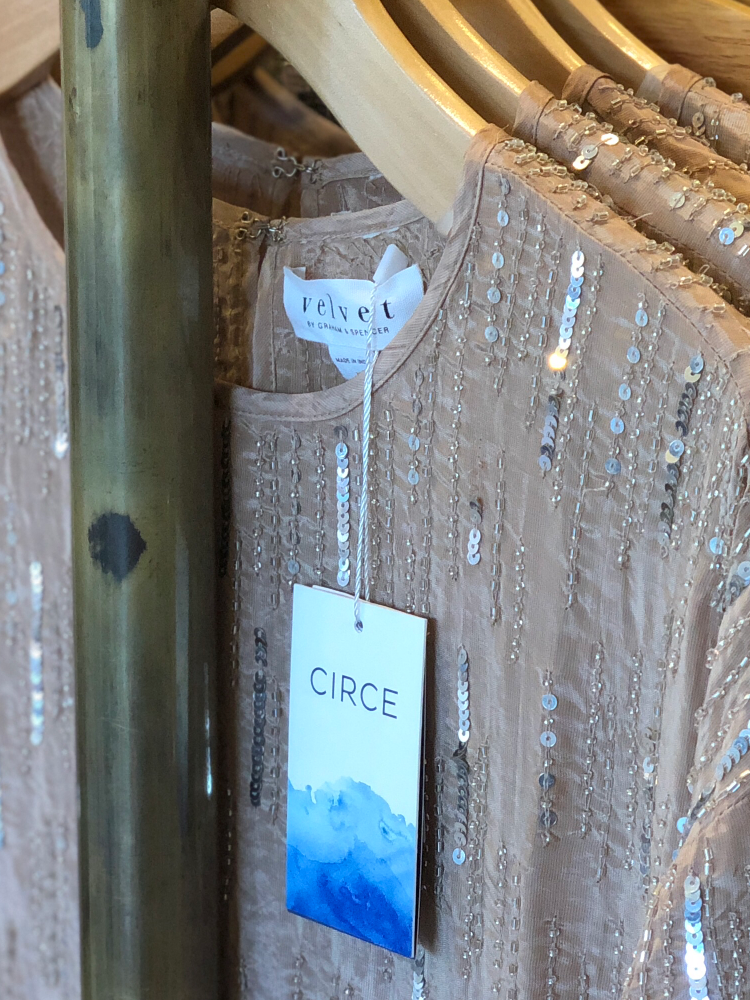
Their new look speaks to the premium southern style they offer to our coastal community. Offering fashionable apparel and accessories for both Men and Women, this brand needed to be elegant in design while not becoming overly feminine.
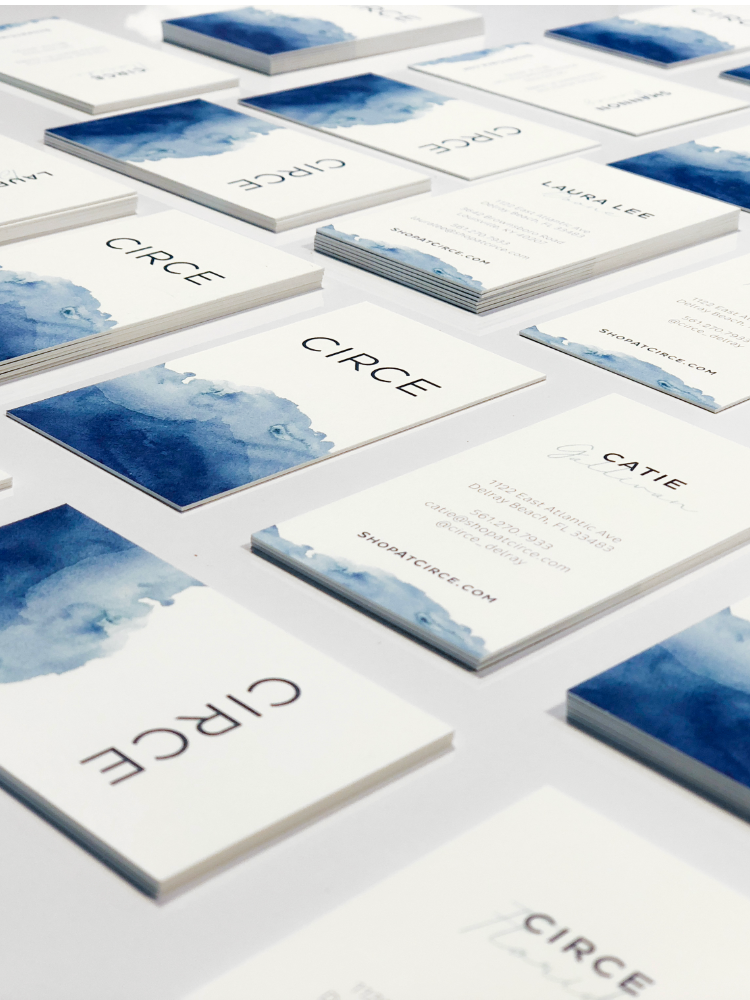
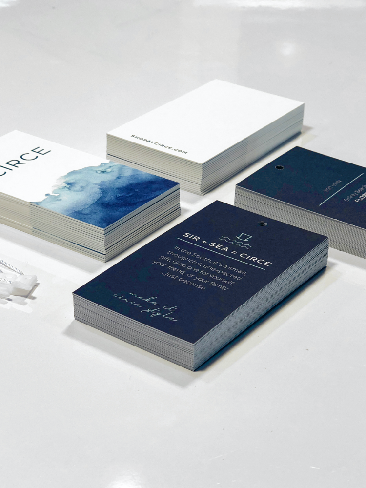
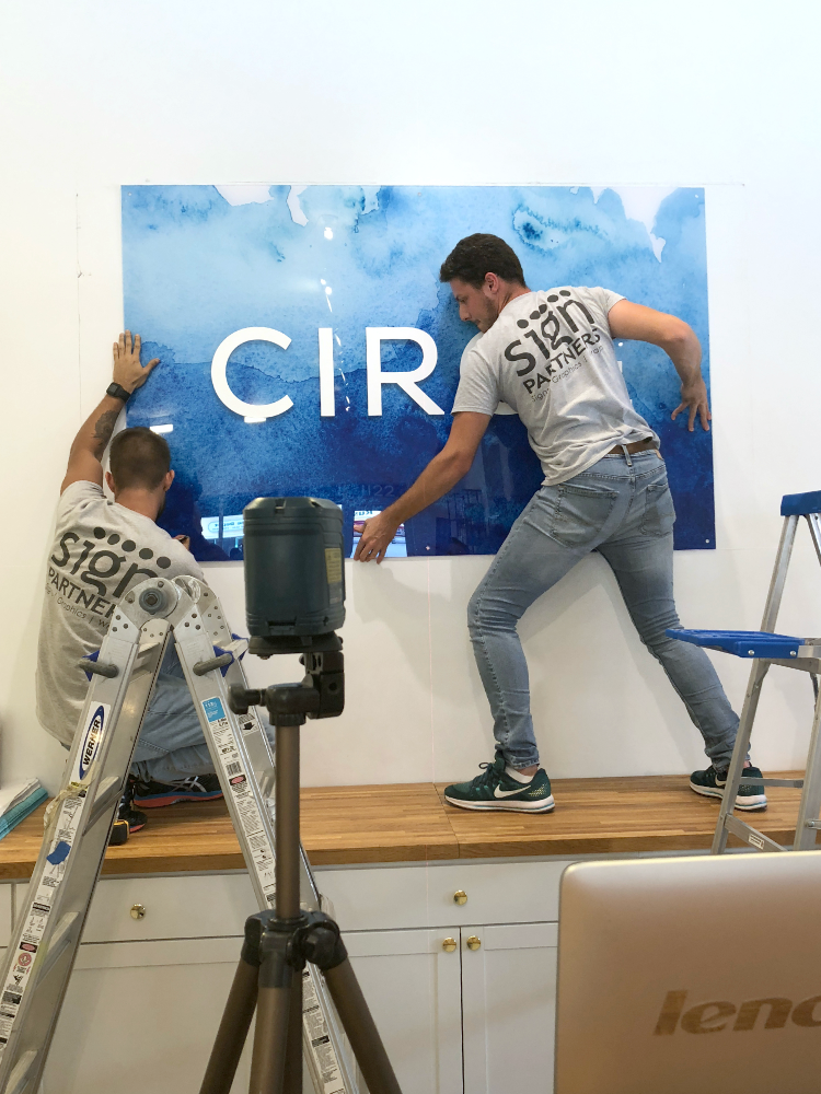
To further the challenge, we quickly learned that they needed to have an identity that worked within the boutique environment of Delray Beach’s coastal town. But, it also needed to work within the more rustic environment of Louisville, Kentucky. The end result is a solid typeface paired with an organic watercolor element that leads you throughout all of the CIRCE collateral.
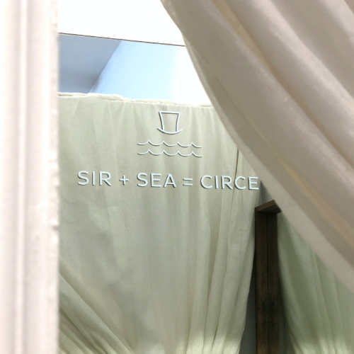
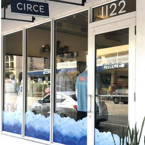
The watercolor mark was born from the concept of a coastal wave; the tide coming in and out. That graceful, beautiful, unique visual it creates continually. From this, a system was created and a refreshed brand was born.
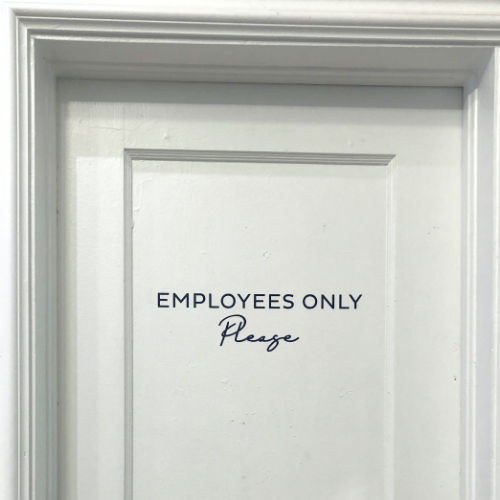
Today, you can walk the avenue and see a brand that is not only memorable but that invites you to come in and experience CIRCE style.
If you have a brand that you feel could be working a little harder at telling your story, let’s talk!

