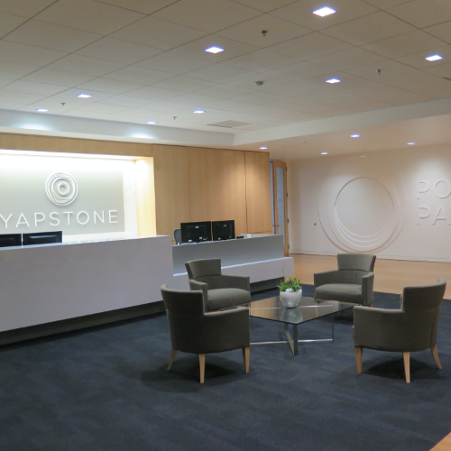
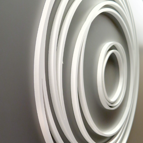
Yapstone
GETTING YAPSTONE UP TO DATE
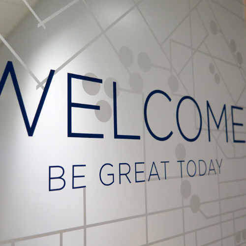
Having recently put a large effort behind rebranding the Yapstone company as a whole, they felt that it was crucial to partner with an agency that could translate their new brand into their space. We met with key players within the organization to understand their goals for the office, obstacles to overcome, and get a sense for the true workplace culture of Yapstone.
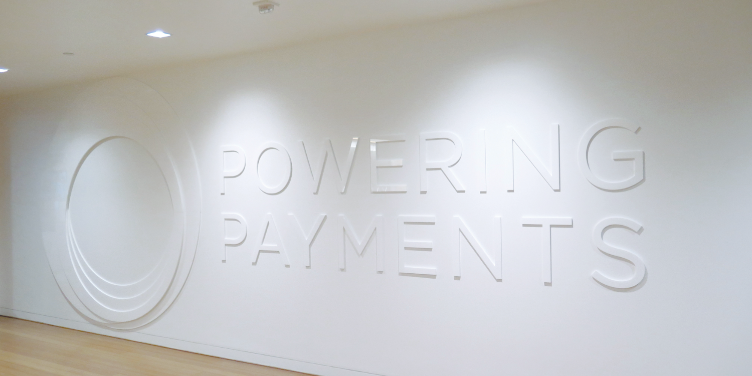
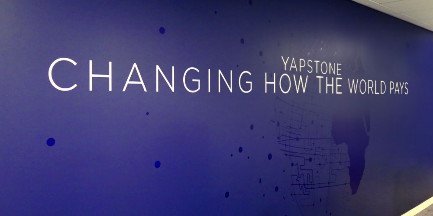
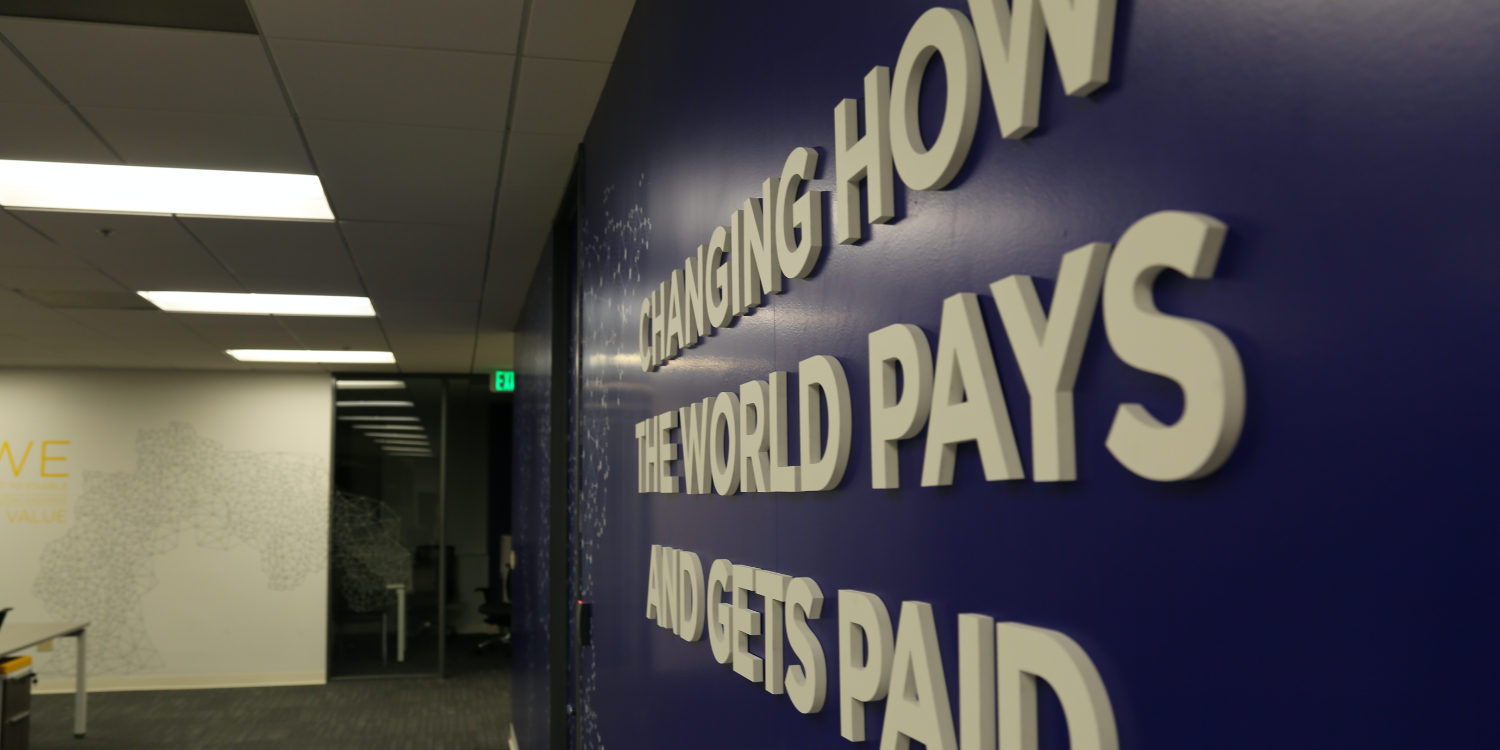
The Takeaway: Yapstone is a rapidly growing organization that is trying to attract top talent from the Bay Area. They needed to be relevant in the fast-paced, youthful tech scene of San Francisco, but they didn’t want to be off-putting to their current Walnut Creek market. Given that their brand is still new within the organization, they really wanted the new built space to embody their fresh look at every touchpoint, while creating a memorable experience for employees.
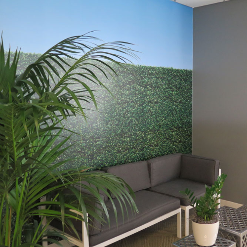
OPEN OFFICE FLOOR PLAN
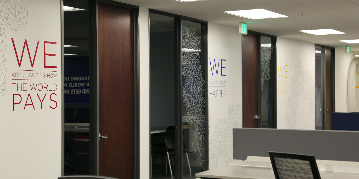
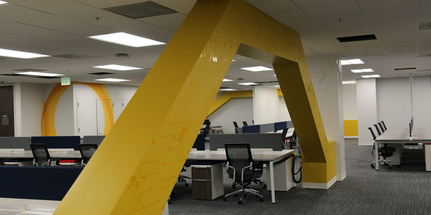
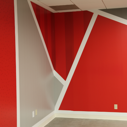
With an open office floor plan, it was crucial that we accomplished two things in addition to ensuring the maximum density in workspace. First, we needed to create strategic break out spaces that fostered collaboration. Second, we needed to ensure that a cohesive look and feel served as a red thread weaving throughout the branded space. The result was a bright, open space with branded messaging strategically positioned throughout, using color and shapes to differentiate from collaboration to conference to work space.
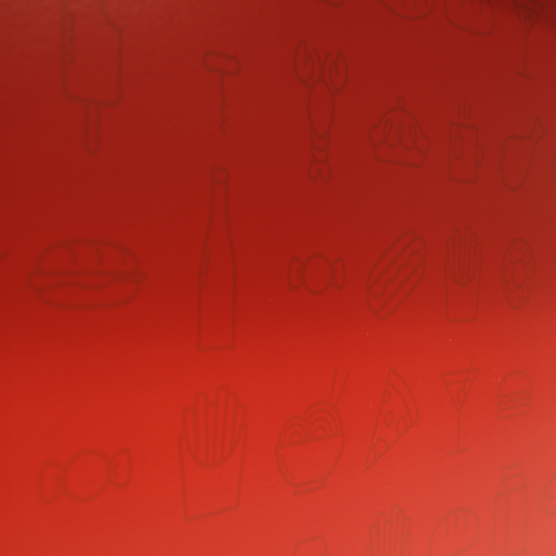
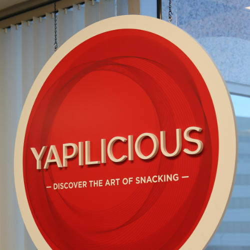
YAPILICIOUS
A snack bar featuring daily favorites, this space also doubles as an all hands space. It incorporates the Yapstone texture throughout paired with the core brand red. Bold and artistic with a nod to industrial, this space offers staff another unique space to collaborate and unwind. From custom illustrations to a hand made chandelier feature, this space leans into the artistry of the company and inspires creativity.
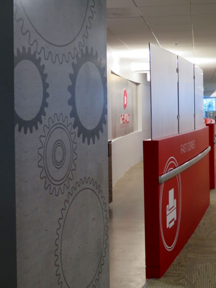
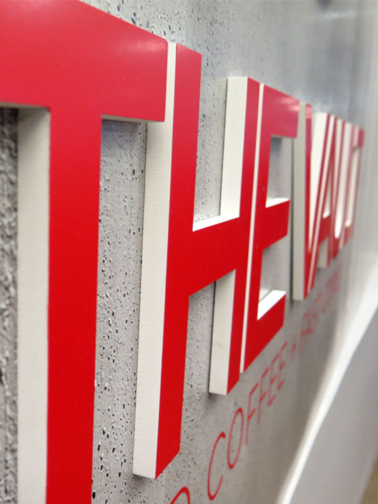
THE VAULT
This coffee and copy center’s name and identity was developed to align with the core Yapstone brand. We went with “The Vault,” which lends itself to the financial sector. The color and the font align with the core brand. This space was designed to be more industrial in look and feel with concrete textures and gears.
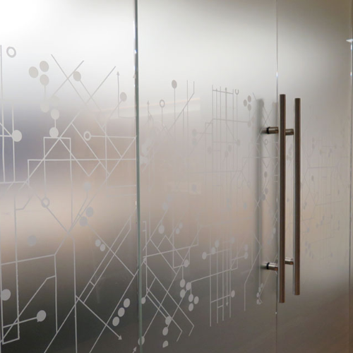
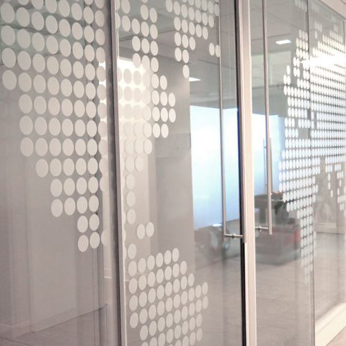
HUDDLE ROOMS
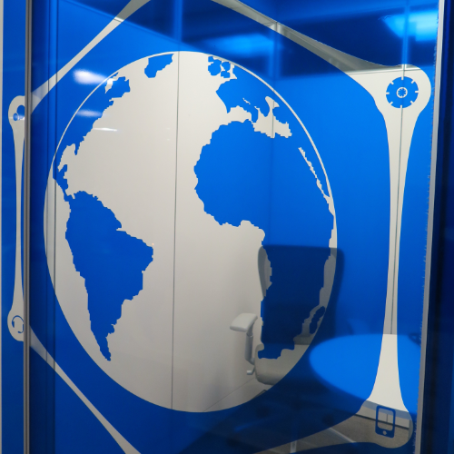
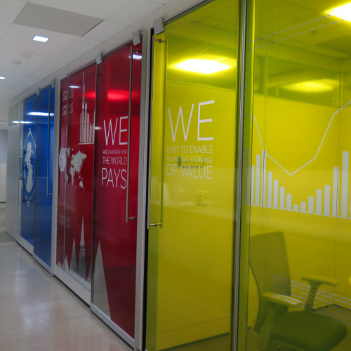
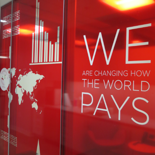
In an effort to capitalize on the new brand colors and values, all of the huddle rooms were covered in transparent vinyl with router cut graphics and messaging. Furniture was sourced to compliment these colors, resulting in casual break out rooms branded with the core Yapstone colors inside and out.
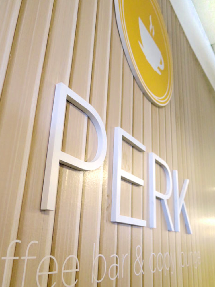
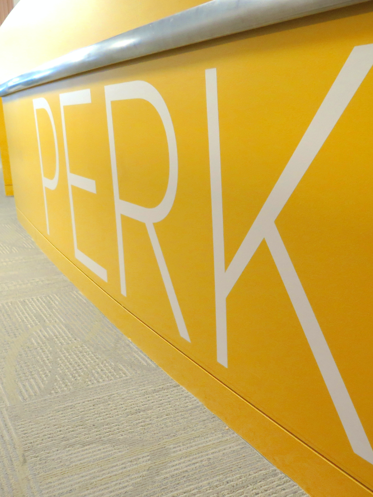
THE PERK
This coffee and copy center was named so as to align with the core Yapstone brand. The name “perk” refers to both the “perk” of free snacks and coffee, the style in which the coffee is made, and the energy with which Yapstone employees approach their work. This space was designed to be more natural in look + feel with wood textures and honeycomb patterns. The colors, textures, and detailing throughout the space converted this uninviting breakroom into a vibrant social hub in the Yapstone office.
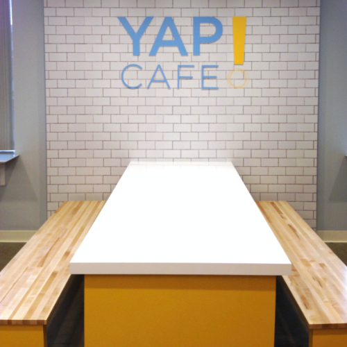
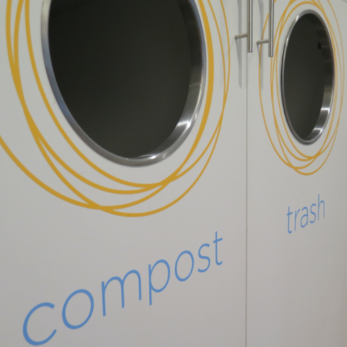
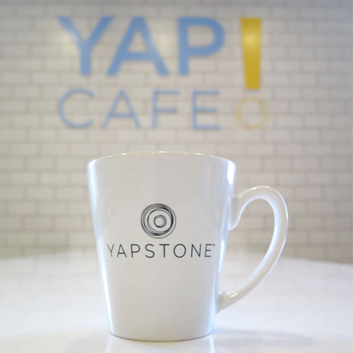
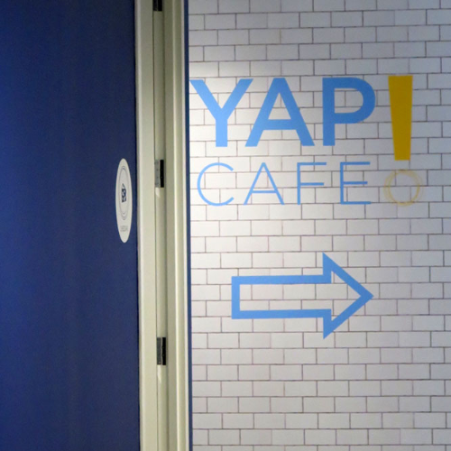
YAP CAFÉ
This is the main break room for staff. It was originally dark, uninviting with limited seating. We brightened the space by covering the two main walls with subway tile and branding it with fresh colors and made use of a clean, welcoming font for the signage. We designed custom bench seating to work with the existing walls and introduced window table tops with seats to maximize the seating and provide a sunny view. The colors, textures, and detailing throughout the space converted this drab breakroom into a vibrant social hub in the Yapstone office.
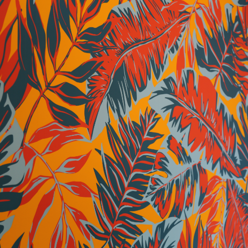
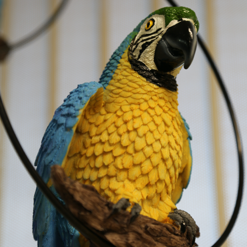
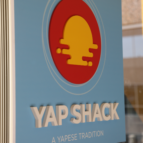
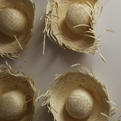
YAP SHACK
Building upon the brand’s culture and the foundation of Yapstone was key in branding the break rooms. Nothing was random, each element ladders up to the larger concept behind the Yapstone brand. The yap shack was inspired by the island of Yap in the Pacific Ocean where yapstones are traded as a means of currency. This is the foundation for the company name and logo and was a perfect element to build upon within the casual break room space. Staff not only enjoy a playful island vibe but trickled throughout the space they find the native language of Yap describing amenities and food items. It’s a vibrant, fun space right down to the swinging birds.


