Andrews Federal Credit Union - Manchester Office
Designing of the Flagship Location.
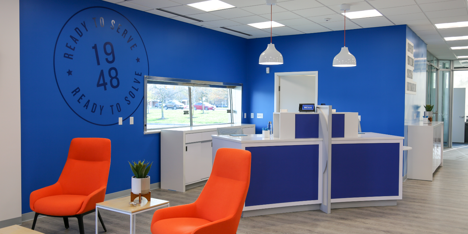
We partnered with Andrews Federal to translate their new brand identity into their retail locations. The transformation started with an old, abandoned bank that Andrews took over. We walked the space with the team the day they took possession, exploring all that was possible from raising ceilings to moving walls to changing flooring. From their, we architected a plan for the space and a timeline to bring it to fruition.
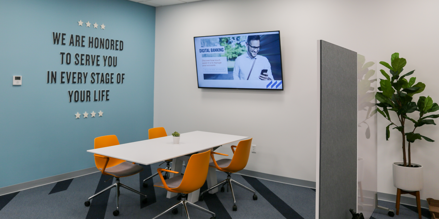
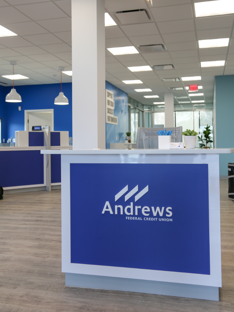
From selecting the paint colors, to the flooring, to the patterns in the carpet, we began to transform the space into an open, inviting environment. From their, we layered on the graphics, bringing hero elements of the brand identity into the space, subtly reinforcing the brand message at every touchpoint.
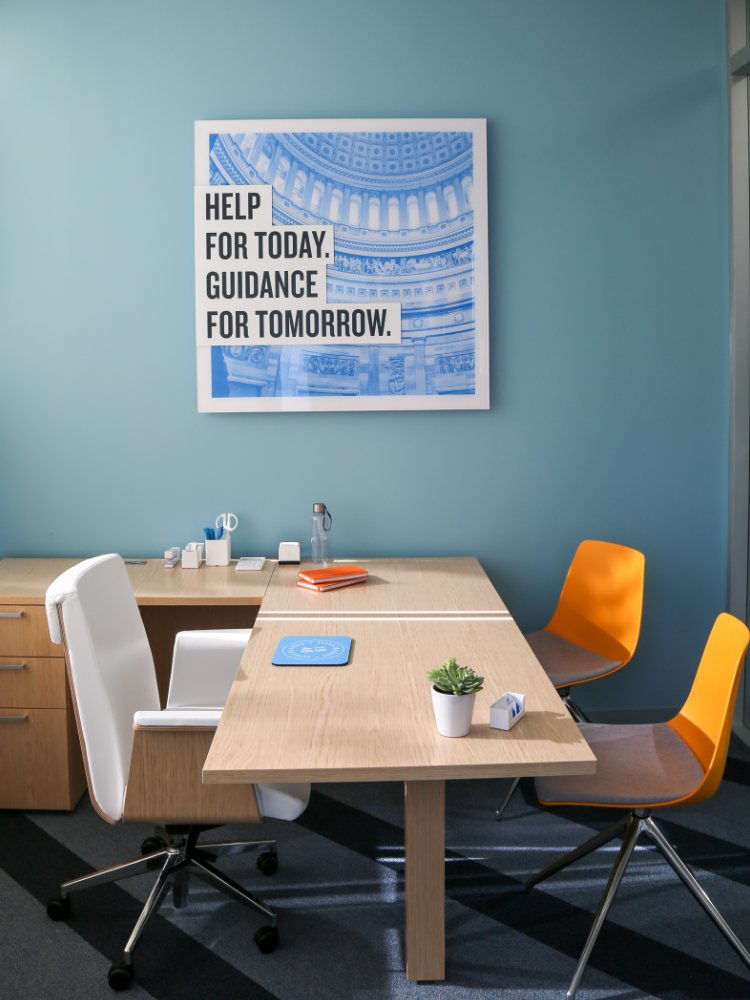
Simultaneously we moved in the furniture package that had been hand selected for the space including some hero pieces that had been custom built to function perfectly within this new space.
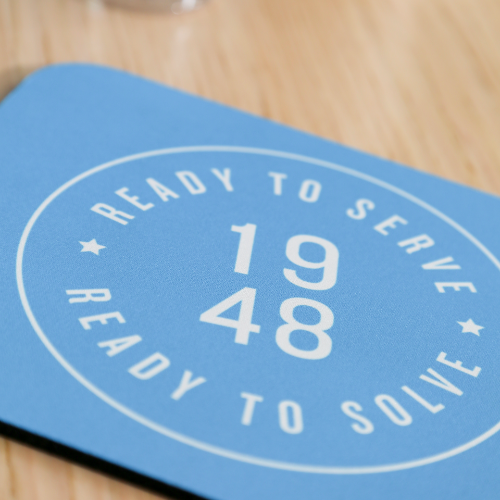
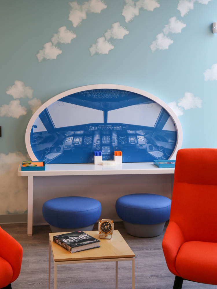
After the furniture was in, the light fixtures hung, and the graphics installed, we moved into the final stages of the project, staging the space. We brought in those little touches that make the space feel lived in, feel like home. For Andrews, that included all the desk accessories, branded coffee mugs and water bottles, coffee table accents, plants, and all the other accents down to the color coordinated markers in the children’s space.

