Miniter Group
A LITTLE BACKGROUND
Over the past 50 years, Miniter Group has worked with lender partners to become one of the nation’s largest auto and mortgage portfolio insurance providers. Since the launch of their Borrower-Centric Insurance Tracking service in 2006, they have become the fastest growing insurance tracking company in the industry with an average annual growth of 86%.
This rapid growth is a great problem to have but it landed Miniter Group in a situation where they had not only quickly outgrown their space but they now needed a new home that would not just accommodate their current staff but that would serve to attract and retain additional qualified members to the team.We met with the owners of Miniter Group to understand their goals for the office, obstacles to overcome, and get a sense first hand for the challenges this new space held both from an aeshetic standpoint and for them as an organization.
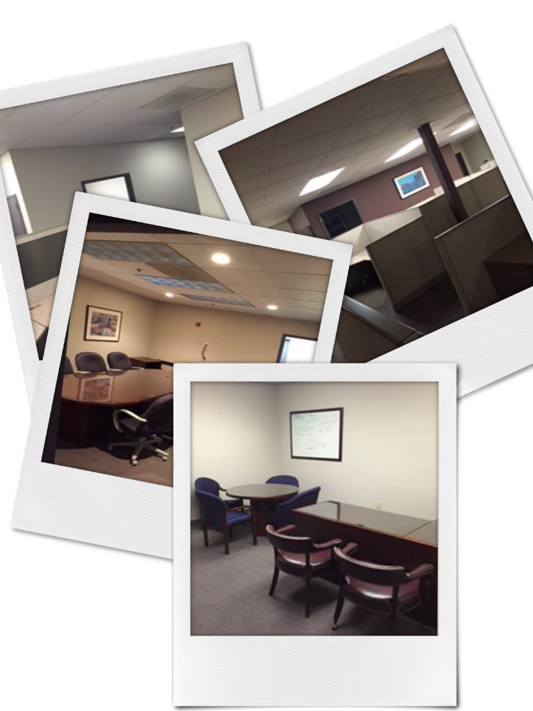
With a complete overhaul on the books and a 3 month timeline, we hashed it out and got moving! The Takeaway: We needed to provide Miniter with a bright, fresh, inviting space that would keep morale high and provide a unique employee experience. We needed to take a building with low ceilings, virtually no windows and outdated cubicles and create a space everyone was not just excited about but proud to call home.THE
CHALLENGE
To accomplish all of this in 3 months and without any major demo work to the space.
LOOK + FEEL
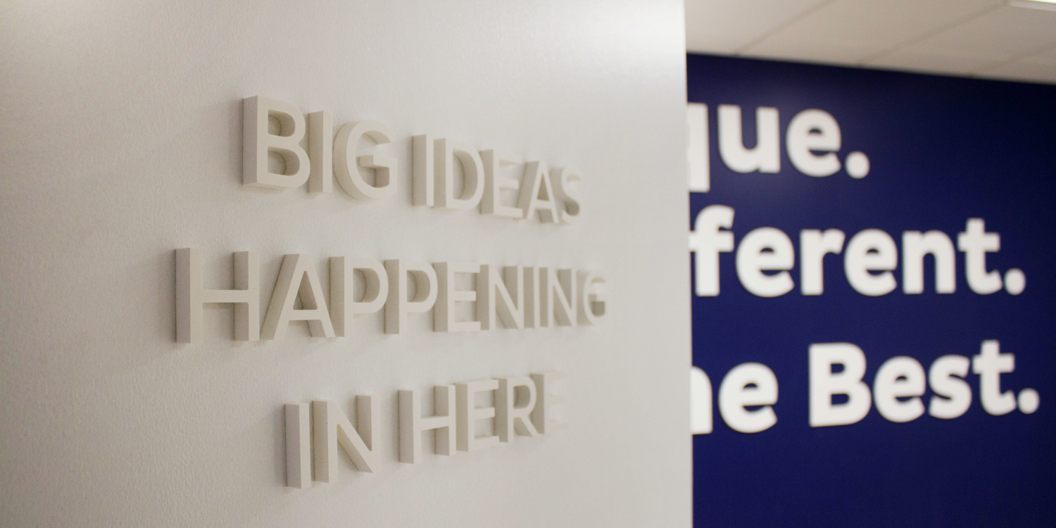
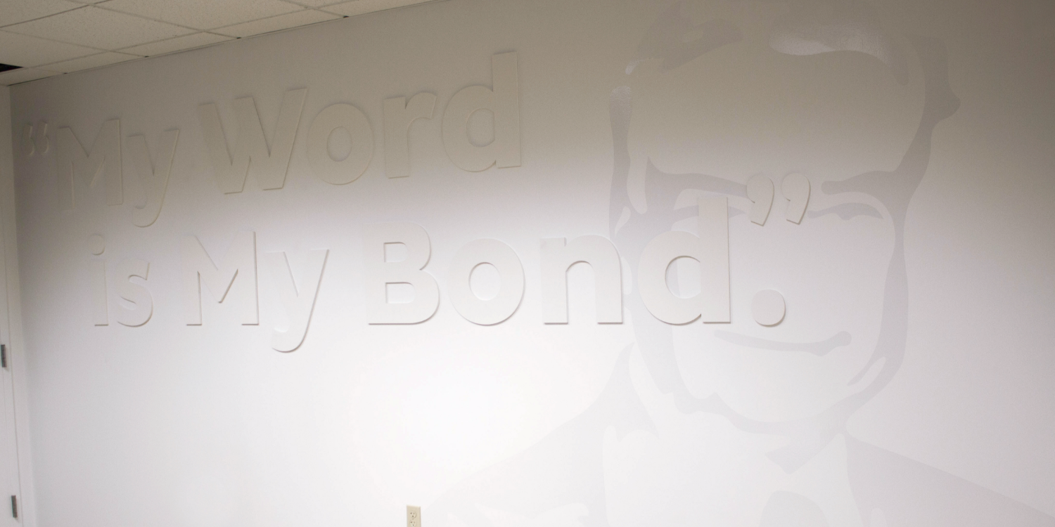
By incorporating the brand colors, logo and key elements from the company’s history, we were able to develope a branded space that nodded to the company’s rich past while positioning them for all the possibilities the future holds. Textures, colors + patterns were incorporated throughout to create a space that was uniquely Miniter. A space that married the old with the new. A space that was relatable for those veteran employees while not only relevant, but exciting for the booming young population coming on board.
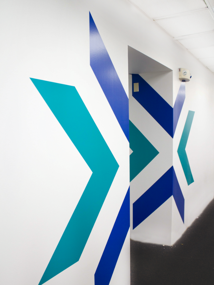
We needed to brighten things up and provide some directional cues throughout the space. We painted bright white to set the tone for an overall brighter space. Then with this canvas painted, we overlaid bold graphics and icons throughout. We created an ownable space with mini areas throughout. These broke up the space and made the building easy to navigate.
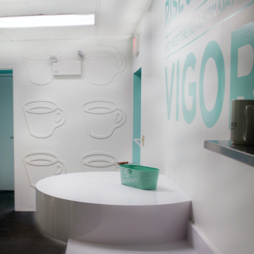
ARTHUR’S COFFEE SHOP
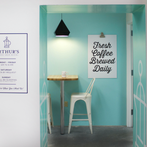
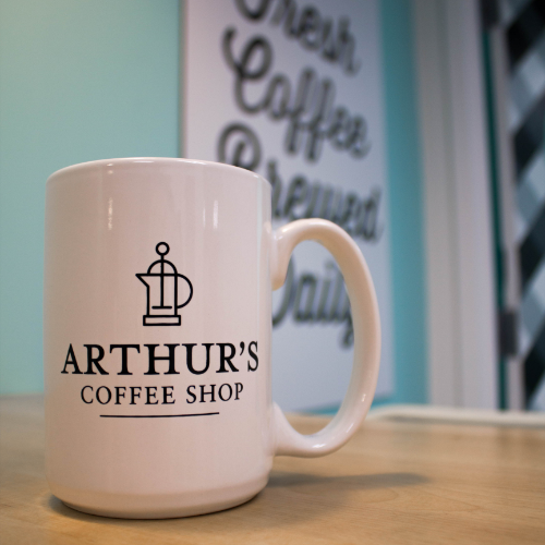
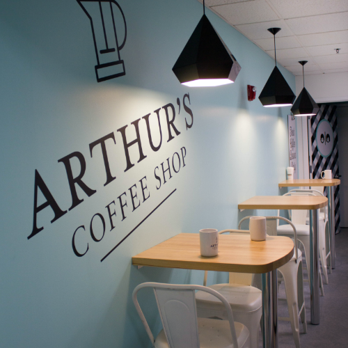
Take a small, long storage space with no windows and two awkward bathrooms and let’s see what you can do. The result, an adorable cafe coffee shop named after the founder of Miniter Group. It’s bright, inviting and filled with charm. Every square inch was addressed from custom millwork and tables to the lighting, painting, flooring and custom branded look. With coffee cups in hand, Arthur’s Coffee Shop opened it’s small door and was an instant crowd pleaser.
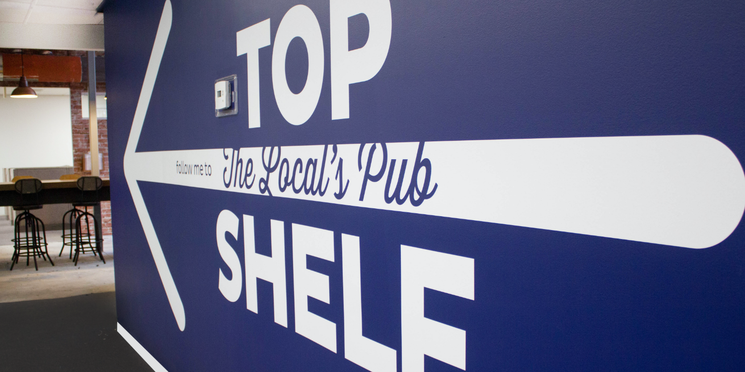
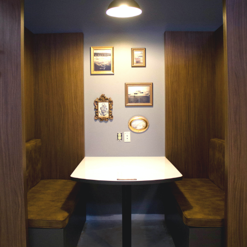
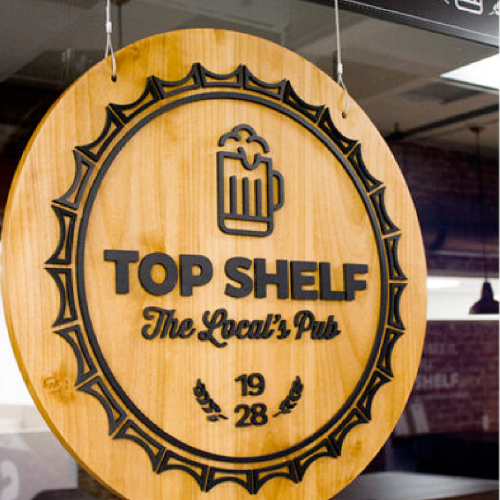
TOP SHELF PUB
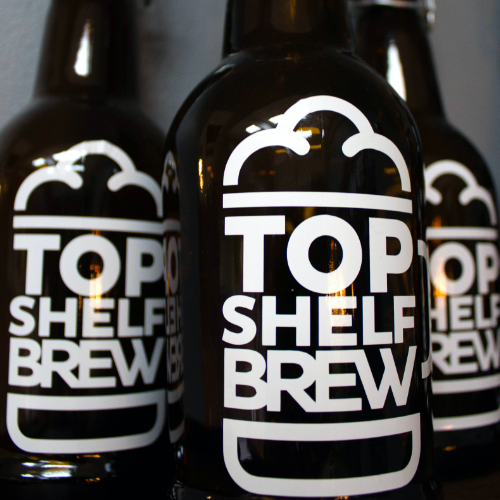
Take a sad excuse for a kitchen and make it a breakroom staff actually WANTS to take a break in. We used our one wild card and got two walls replaced with glass and wallah we were on our way to a Boston inspired Pub. Pulling inspiration from the founder’s love for the water and the name of his boat we landed on a killer pub with everything from cozy booths to beer bottles and old quirky pictures hanging on the walls.

