NO WEAK COFFEE = NO WEAK SPACES
1
amazing team
42
spaces concepted and counting
332,458
miles covered
1,094
coffees consumed and counting
BRINGING TO LIFE THE ORIGINAL CRAFT COFFEE
When Alfred Peet opened the first Peet’s Coffee, he vowed to always provide his customers with the finest coffees on the plane. He believed no detail was too small and that compromises were never worth making. We have taken that passion and used it as the foundation for translating the Peet’s brand into the built space.

A PICTURE IS WORTH A THOUSAND CUPS OF COFFEE
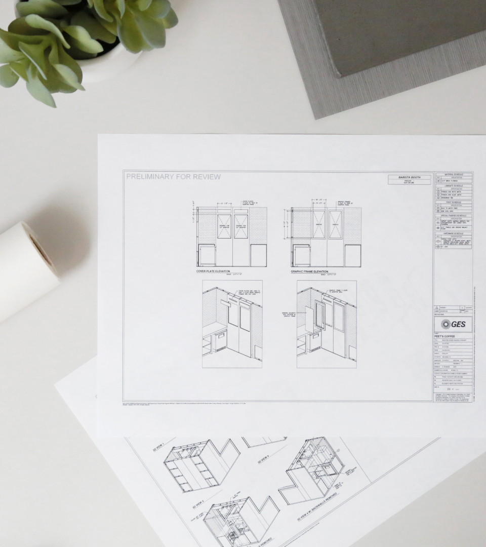
Translating the Peet’s brand to each built space begins with a floorplan; a roadmap for the build out and a canvas for the design. Our team creates a design that maximizes the space while creating a natural flow of traffic and intentional locations for all equipment needed.
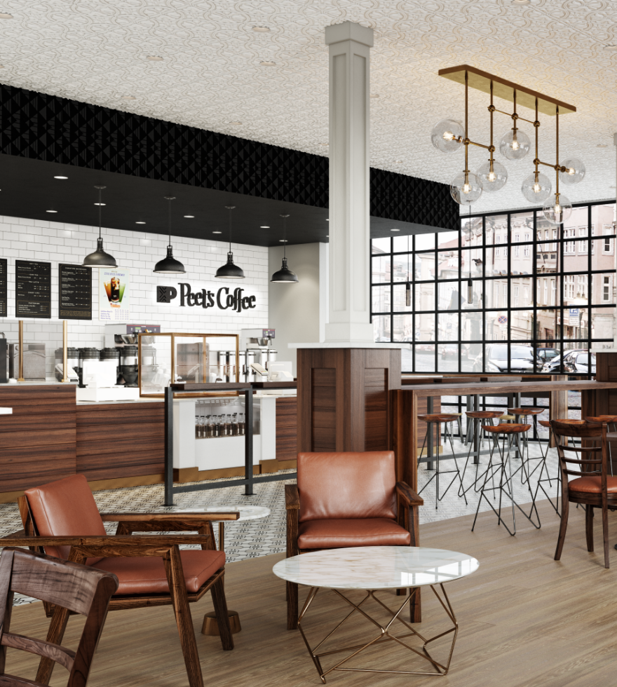
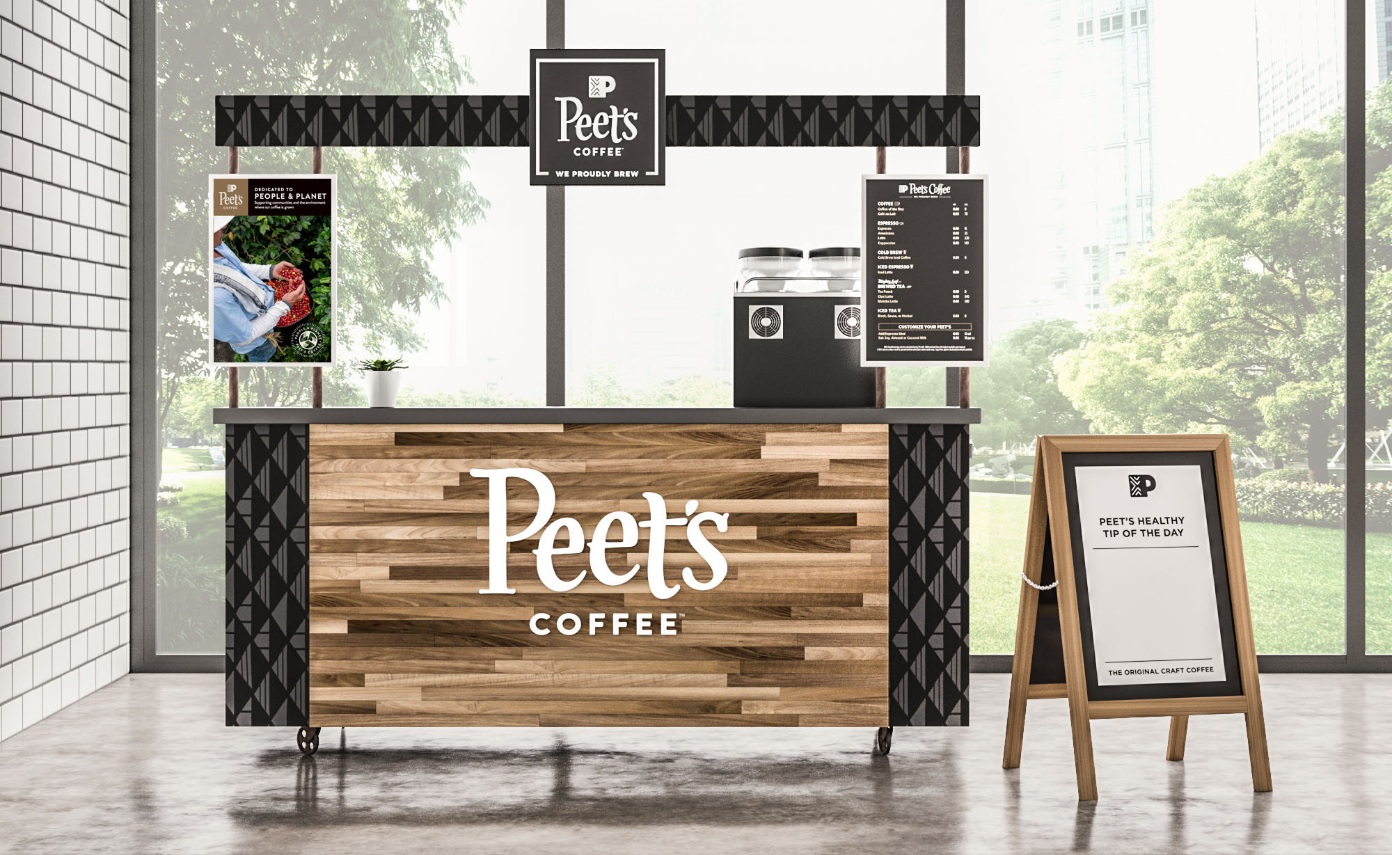
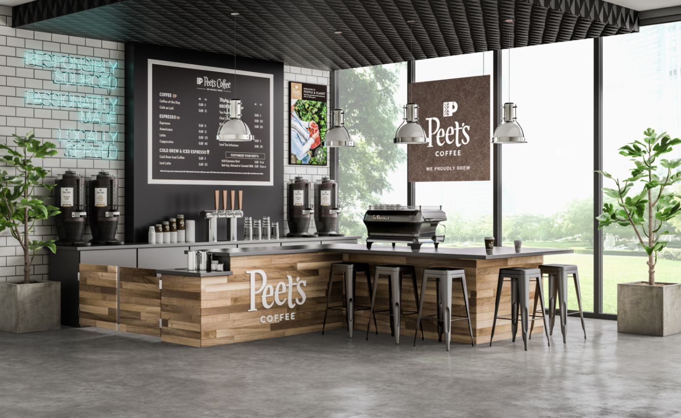
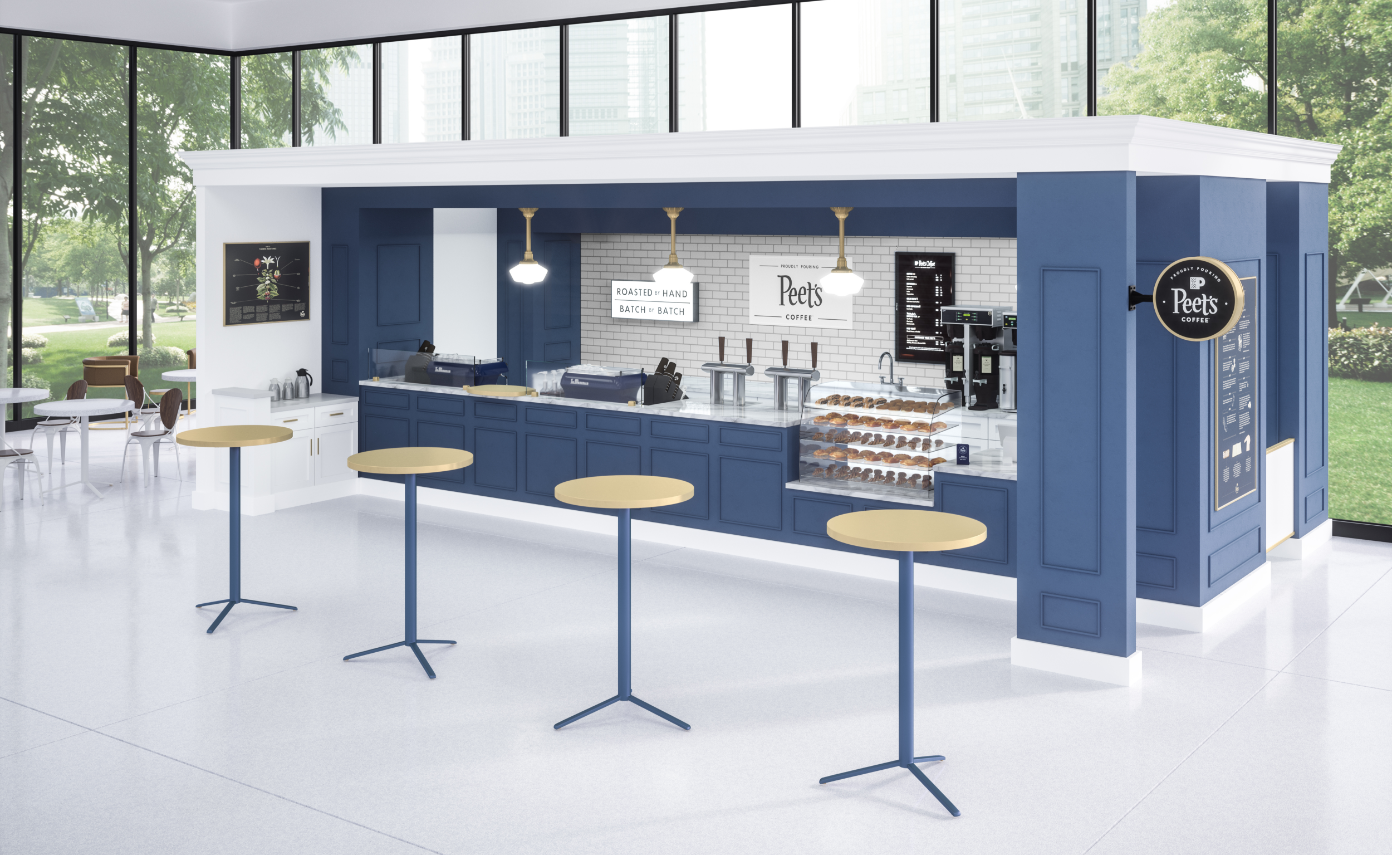
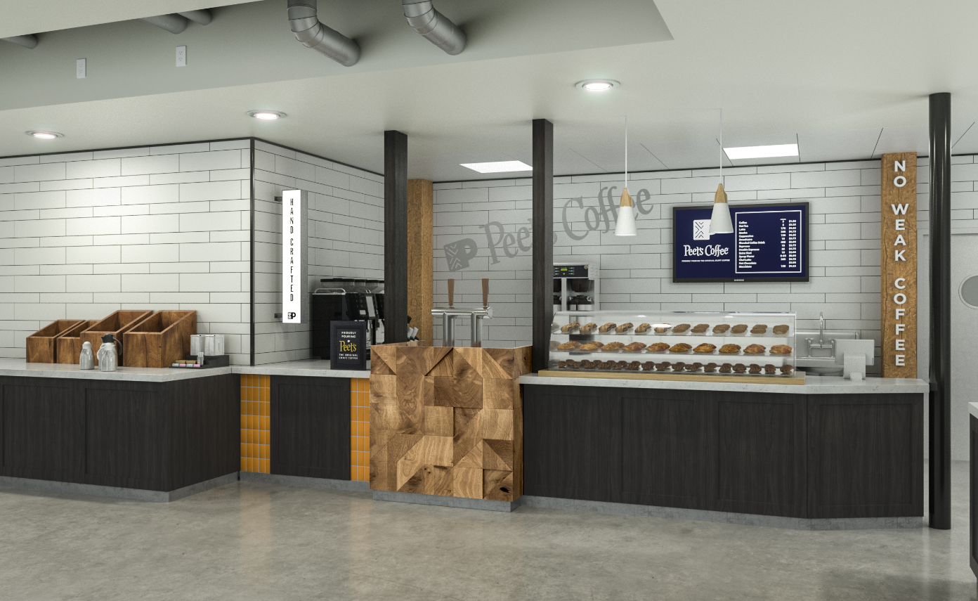
From this foundation, photorealistic renders are created that pair fixtures and finishes with custom branded elements to bring the space to life in a way that is authentic to the Peet’s core brand.
It is through these detailed renders that key stakeholders are able to easily buy into the project, understanding what the end result will be.
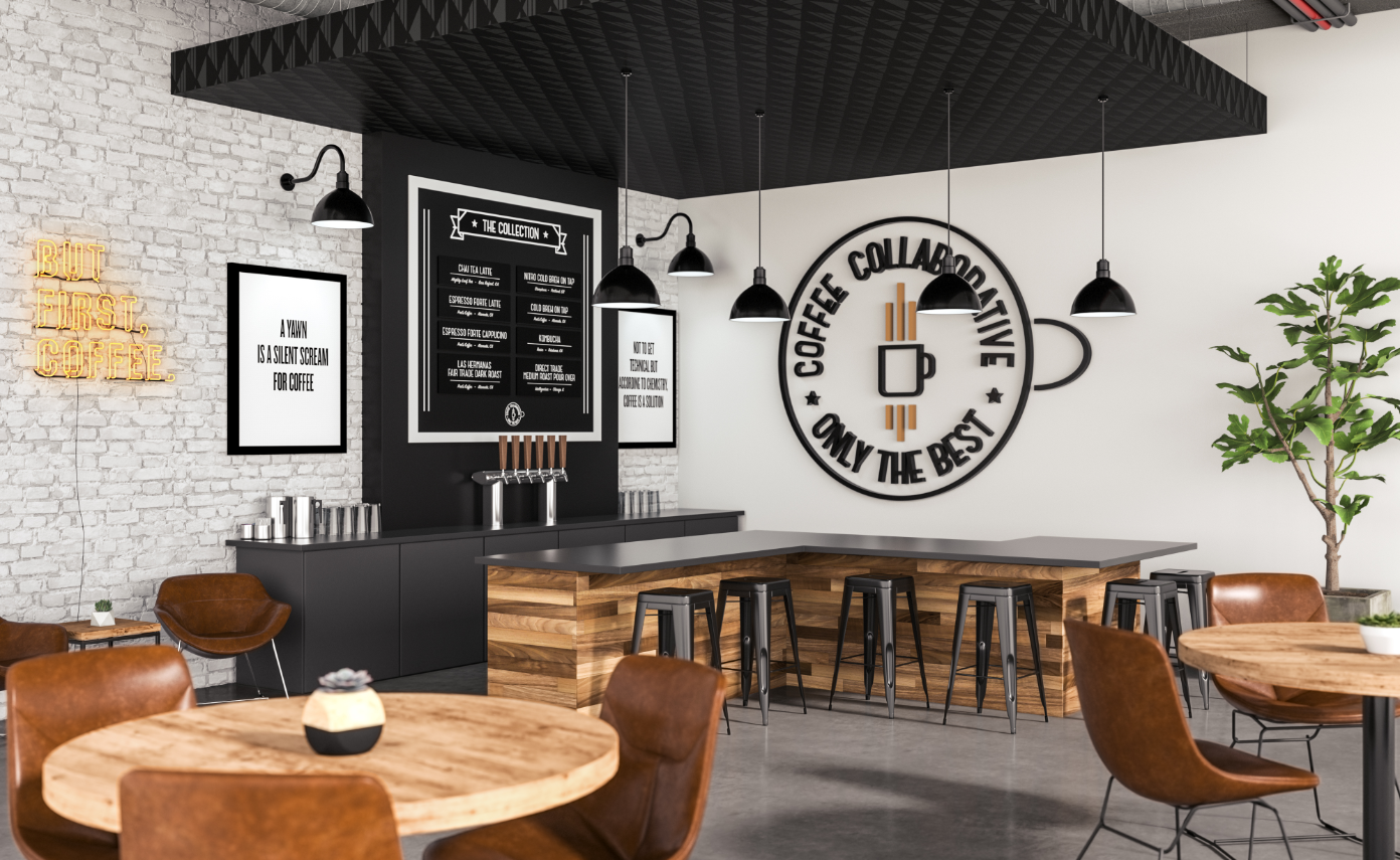
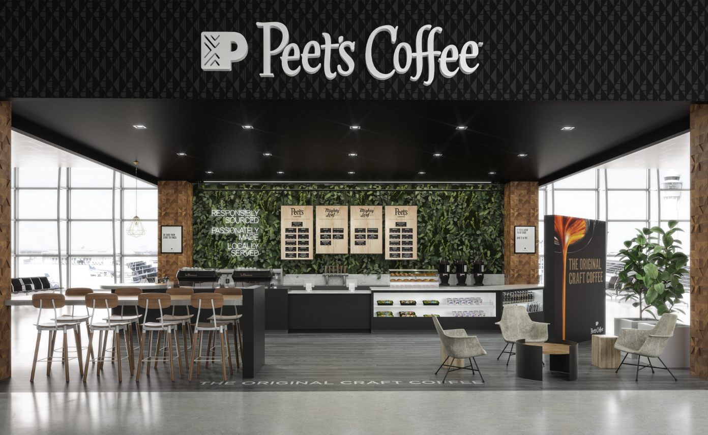
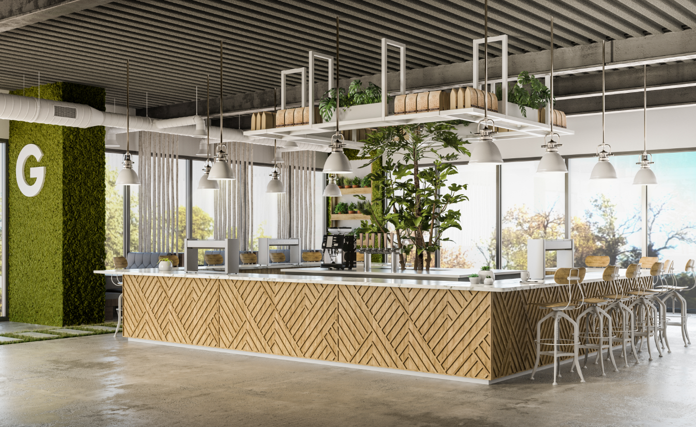
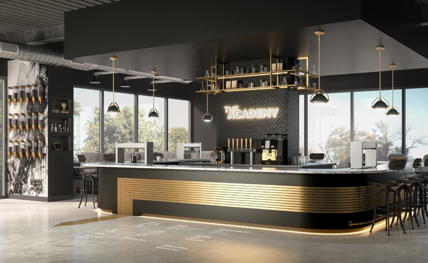
AIRPORTS
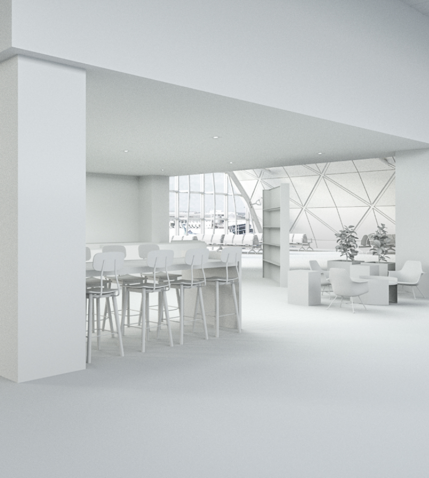
We’ve all had that moment where we are rushing through the airport like a mad person but still HAD to grab that cup of coffee… and we have had that moment where all that rushing ended with a delayed flight. We partnered with Peet’s to architect a customer experience that worked for the person with no time just as well as the person with too much time. An open floorplan allowed room for all those bags we drag along while a clearly designed entry and exit point kept the traffic flowing seamlessly.
If you need to think about where to go, something’s wrong.
We worked with the team to ensure every element that was layered into the airport spaces was purposeful, creating a calming space that is on-brand and airport compliant.
A PLAN TO GROW
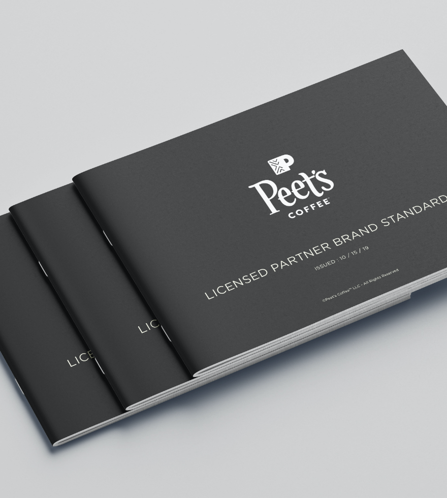
We partnered with the Peet’s team to generate a hero concept for their Licensed Partner program. As we audited the brands existing program, we saw how the lack of guidelines was resulting in a diluted brand presence. We took a step back and did a deep dive into why partners were making certain decisions, what restraints were common, and what were must haves for the Peet’s team. Then we got to work architecting a space that addressed these in a way that was realistic and easy to implement without breaking the budget.
The end result was a space that was on brand but also in touch with the local area, allowing partners to infuse personality and local flavor at key locations without overpower the Peet’s branding that remains at the core of the design.
LET’S TALK TRADESHOWS
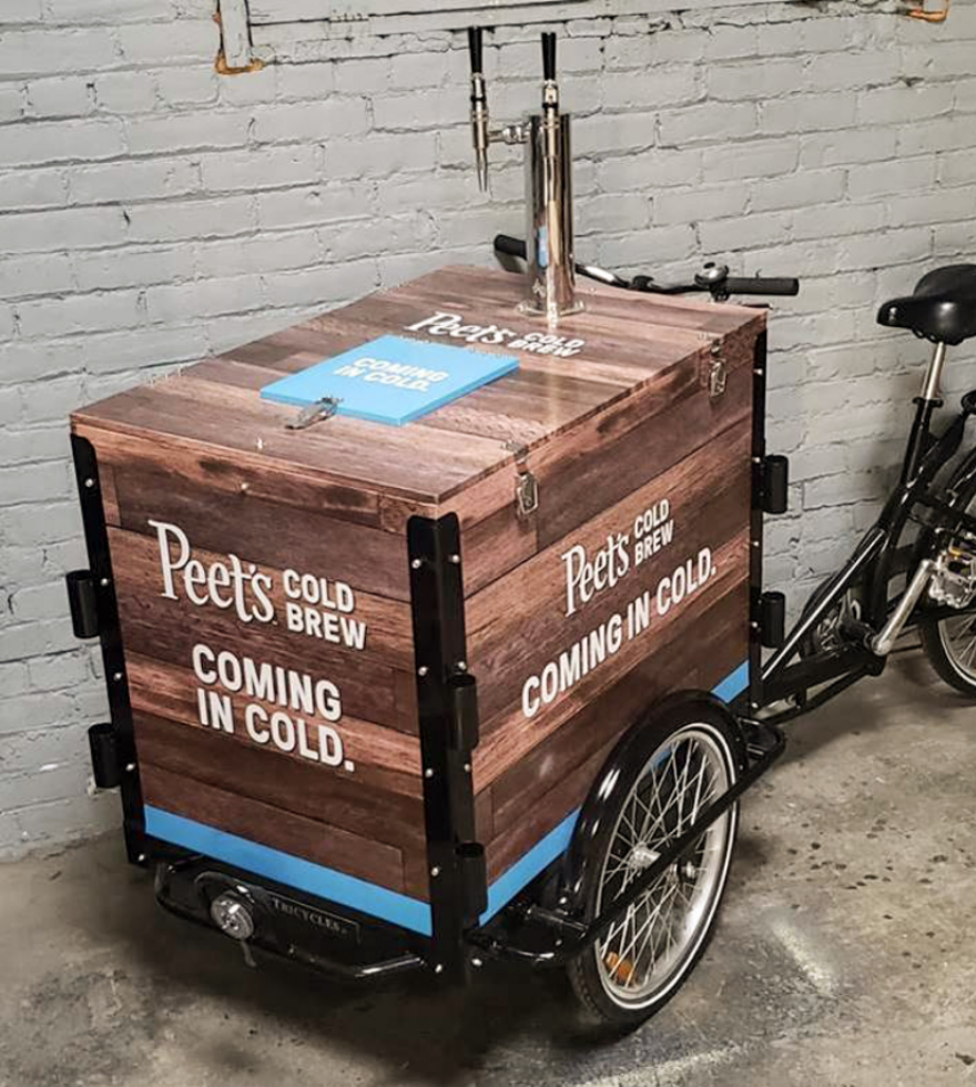
When tossing around ideas for the Peet’s large format trade show booth designs, crafting a branded, memorable experience was paramount.
Our team immersed ourselves in all things Peet’s: the fundamentals of the brand, its vision for the future, and its product line being promoted. We created several concepts for the team but ultimately landed on two winning directions. One for Peet’s Cold Brew program and one highlighting the Proudly Pouring program.
From concept through design to fabrication and install, our team was hands on with every step of the process, ensuring the end result was perfect.

THE PROUDLY POURING PROGRAM
Peet’s team leaned on us to help them create a kit-of-parts for their licensed partnerships. After some initial kickoff meetings, we aligned that we didn’t want to just create a kit-of-parts. We wanted to create a presentation that shared those key brand elements in a way that inspired partners and brought to life the brand in a variety of ways, showing what was possible to create while staying true to the core brand elements.
Of course we can’t give away all their secrets, but we can show you a glimpse of the materials created to bring this concept to life.
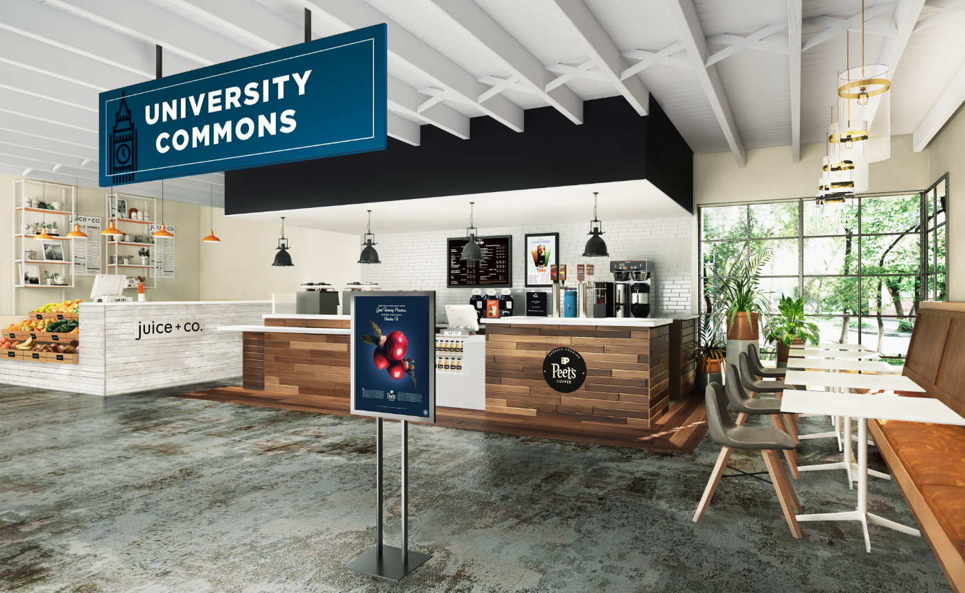
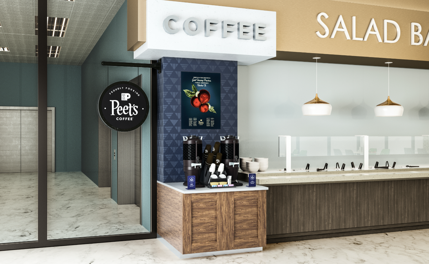
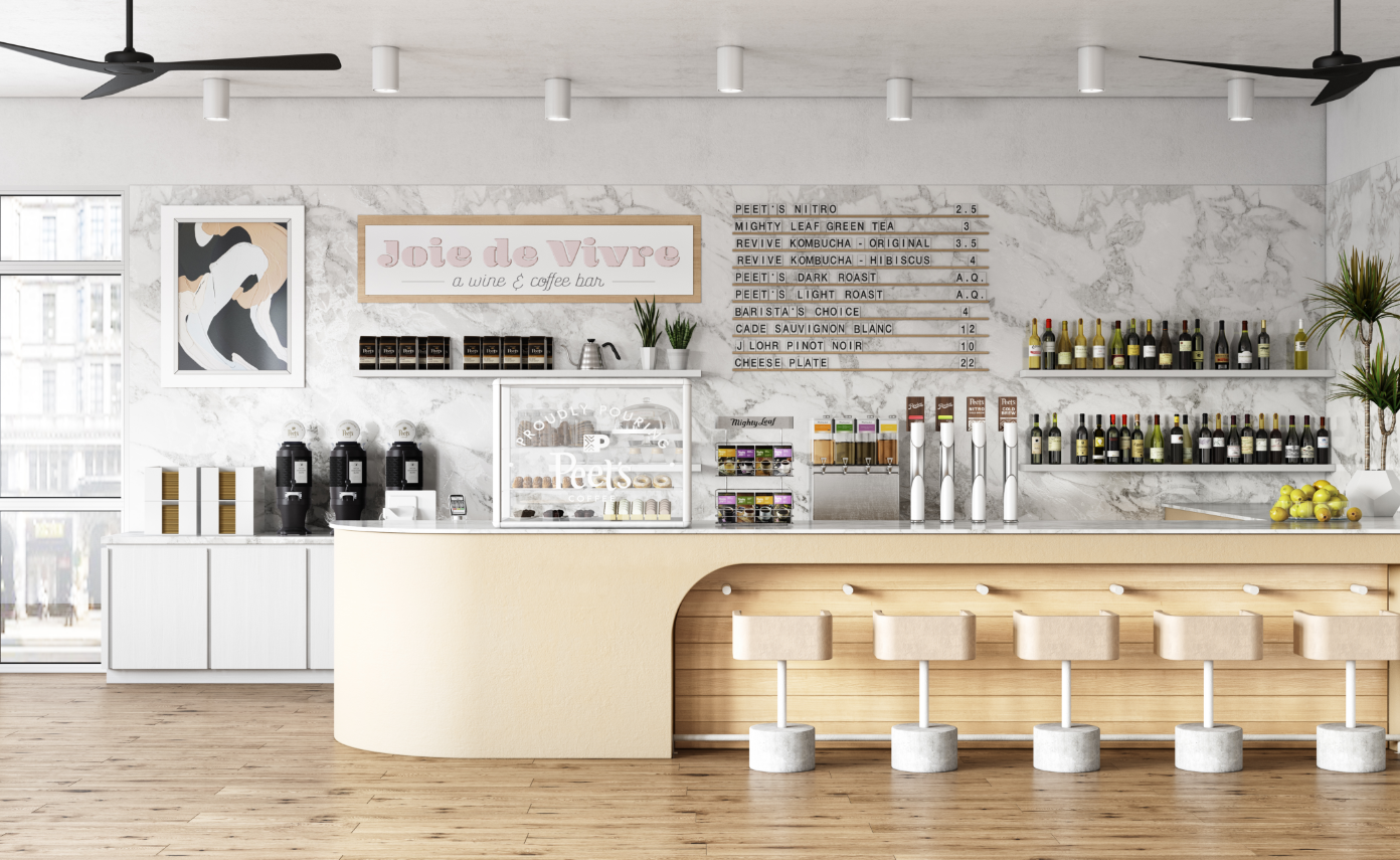
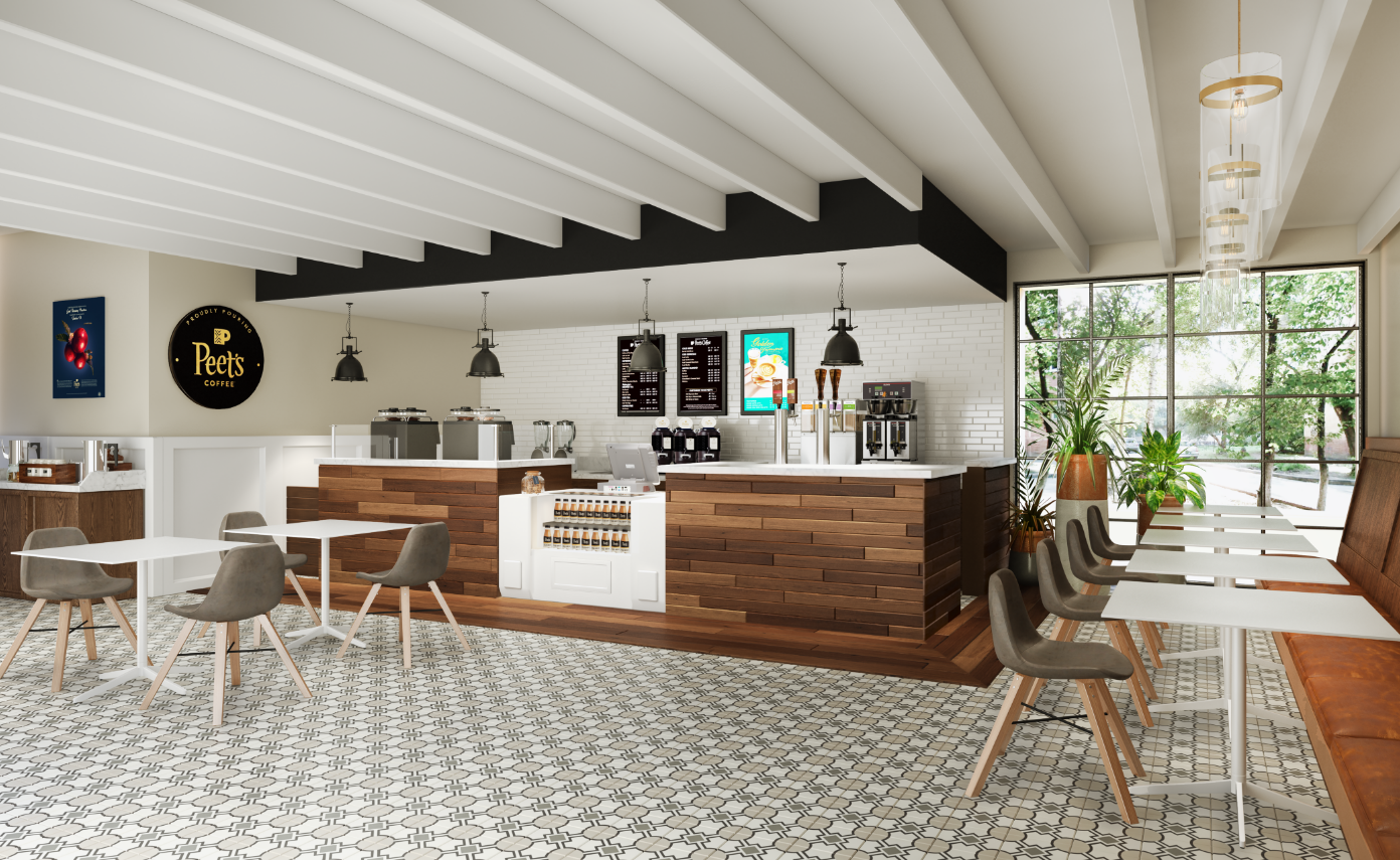
PROUDLY POURING PEET’S COFFEE
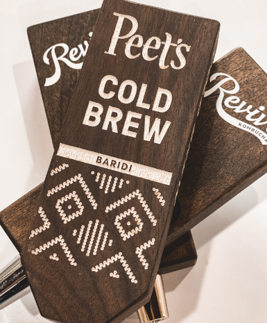
Take a look at a few of the photorealistic renders we created to illustrate how the proudly pouring assets could be extended into real world applications.
YOSEMITE NATIONAL PARK PARTNERSHIPS
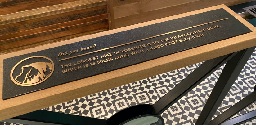
We were brought in by the Peet’s team to generate concepts for their coffee spaces inside of Yosemite. These images highlight one of the larger footprints designed for Half Dome. These images show the use of natural materials recycled from the park as well as elements of history and interesting facts about the park that we wove into our design of the space. Our goal was to create a space that was park first and Peet’s
second and these images show how we made that a winning solution for both brands.


