Heart Hugger
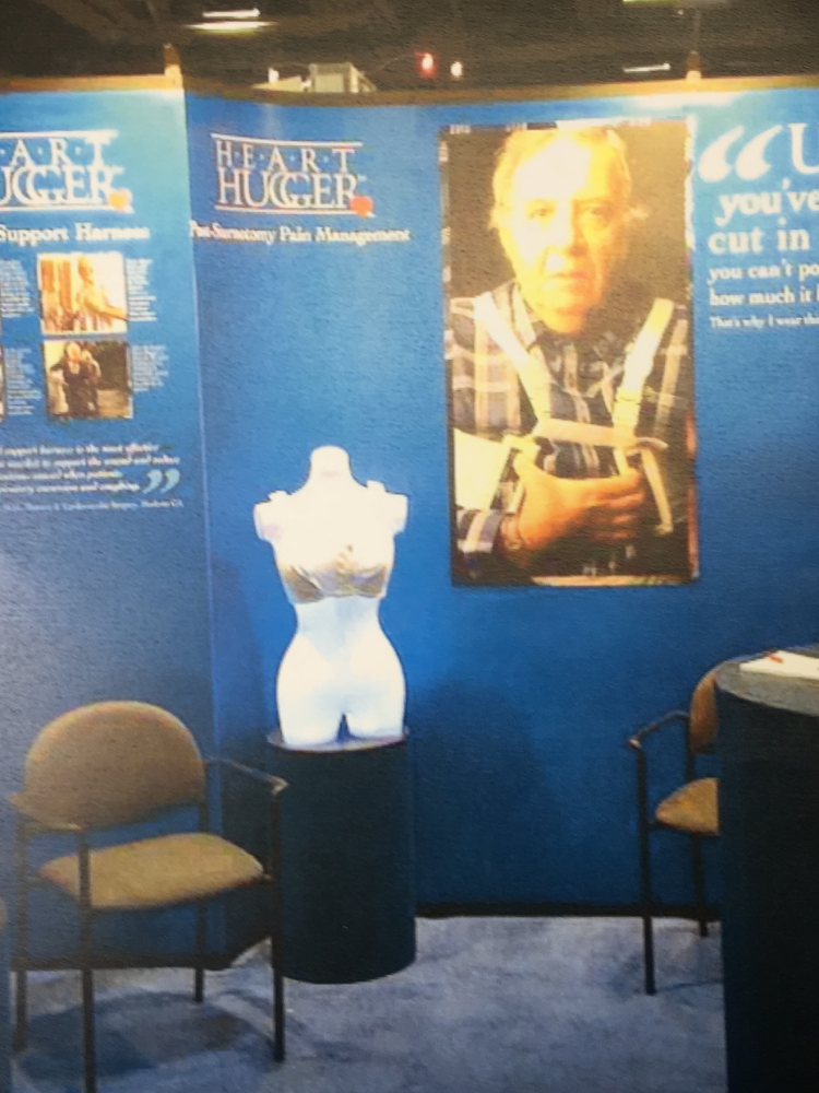
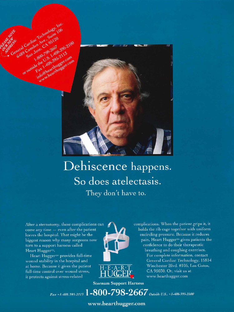
TAKE A LOOK AT THE BEFORE
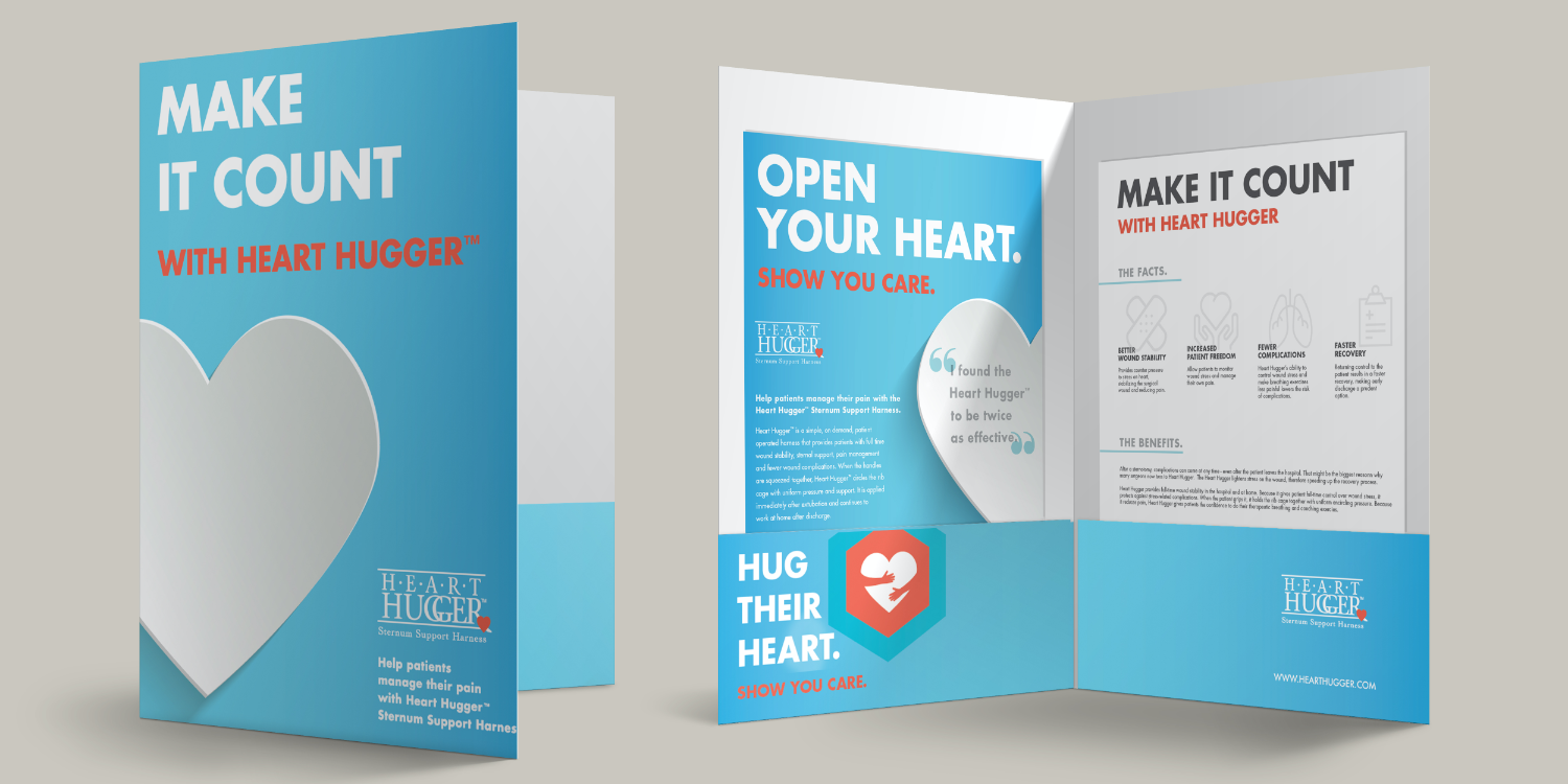
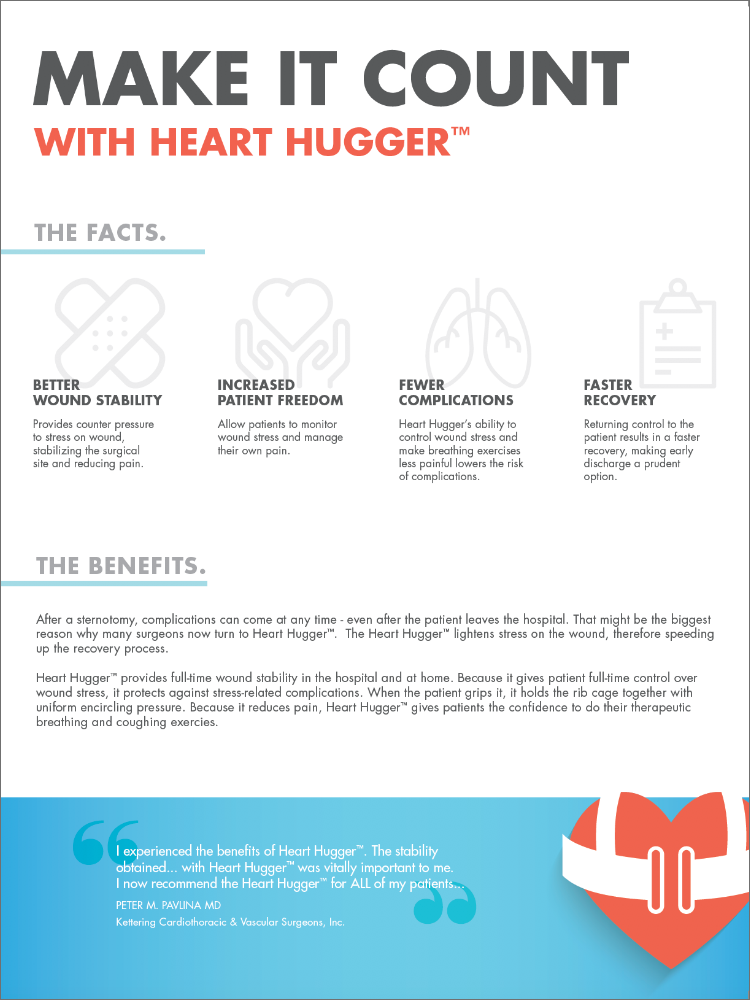
We partnered with HeartHugger to help communicate to the medical community the benefits of the product in a way that conveyed the message and the importance of the product without bringing up connotations of pain and extreme discomfort. This was a true challenge as the product helps improve recovery time and pain management after a truly major open heart surgery. We chose to lean into a welcoming, comforting color palette, and easy to read font and friendly icons.
THE COLLATERAL
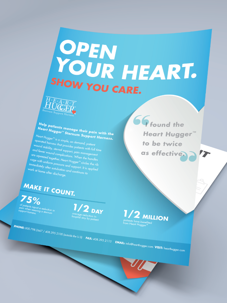
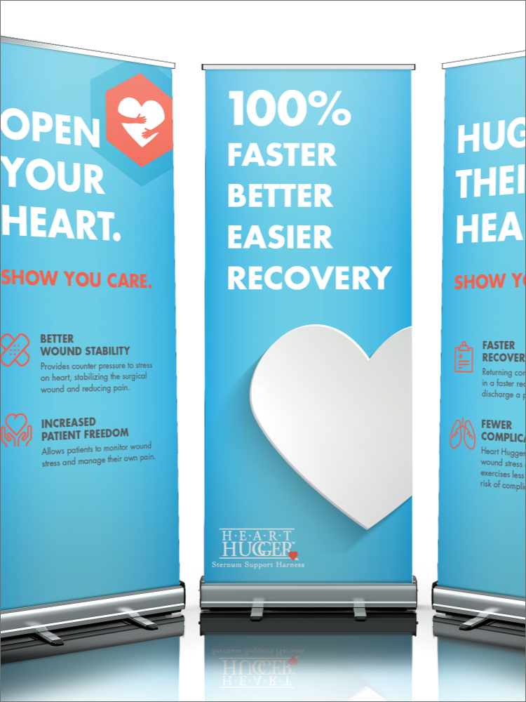
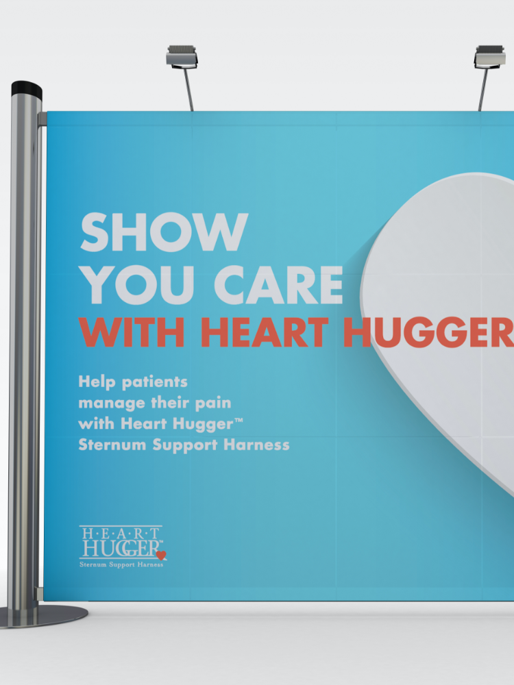
The end result was a refreshed look and feel that created a booth design that welcomed doctors and nurses alike, making them feel comfortable in the space and want to spend time exploring the product.
Simple, direct and easy to comprehend messaging gave this collateral system a breath of fresh air. Key call outs made the piece easy to scan for a quick read while more detailed copy allowed for the added detail needed to inform doctors and nurses of the full benefits of HeartHugger. Overall the rework of this collateral system saw a truly positive reaction from the marketplace and the internal team at HeartHugger.
TRADESHOW BOOTHS
A refresh to the booth design for Heart Hugger resulted in a fresh, inviting appearance for the upcoming trade shows. The welcoming, calming blue paired with the positive play on words associated with the HeartHugger product gave doctors and nurses a reason to stop and discover more. “The booth just drew me in. In the past I had never really noticed the brand. I was honestly surprised to learn they had been at the show for years. I’m sorry I have been missing out but glad to be on board now.”
ROUNDING IT OUT
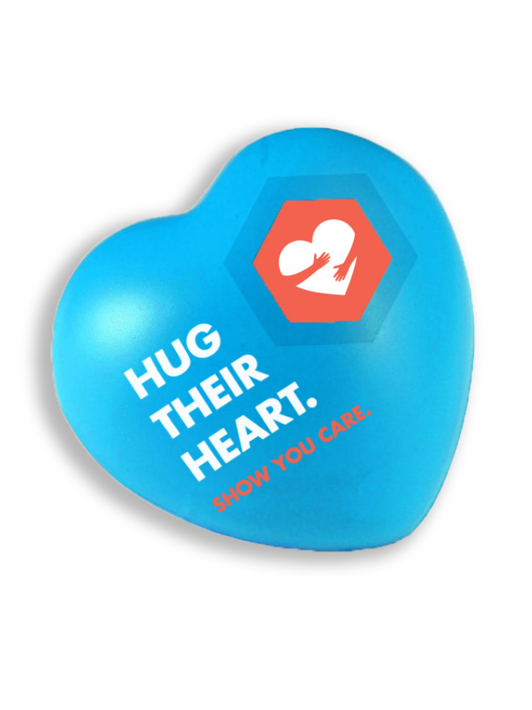
We helped round out their booth with promotional items as fun and useful giveways.

