Let's Talk Packaging Design
CRAZY BUT TRUE:
Eye-tracking studies show that consumers read on average only seven words in an entire shopping trip, buying instinctively by color, shape of packaging and familiarity of location. Best sellers succeed by appealing to the reptilian brain, which decides before logic has a chance.
SO WHAT DOES THAT MEAN FOR US DESIGNERS?
Exactly what then must take place for us as we start to bring to life packaging for some of our favorite brands?
Great design starts long before we start brainstorming and sketching on our infamous writeable tabletops. It starts with the very first conversation with the client. This is where the brief is fleshed out (or challenged) and we agree what the design needs to do, and what the right answer will look like.
It is here where we begin the crucial step of establishing a hierarchy of messaging. What is MOST important for the consumer to see. Then we trickle down the content pyramid from there. Still, with so much to be said about health, nutrition, cooking or usage instructions on any given product the content pyramid can be a struggle. The desire to cut back on the amount of content presented on packaging from a visual aesthetic often directly conflicts with a brand’s innate desire to tell the consumer all they can about their wonderful product.
IN A ONE-SECOND WORLD, LESS IS DEFINITELY MORE.
Go back to the principle of ‘memorable’. Make sure you don’t compromise legibility by overcomplicating packs with too many messages or conflicting visuals. The messaging, while crucial, is really almost secondary to the overall “look” of the package. In a world filled with visual clutter, we as consumers still rely on that initial 1 second glance. This helps to add or delete a product from our set of options. Therefore, your brand identity must be represented in your packaging in a way that is authentic and memorable. This starts with using a consistent color palette, a consistent brand voice, and consistent design elements such as logos and typography across all branding materials.
It’s really almost common sense isn’t it? Think of it in terms of meeting a friend in a crowded bar. It’s easy when you know who you are looking for. But flip the scenario and head out on a blind date. The options at first glance are endless and often overwhelming. You are hoping that the person you are meeting is the one that looks the most “aligned” with you based on looks… and looks alone.
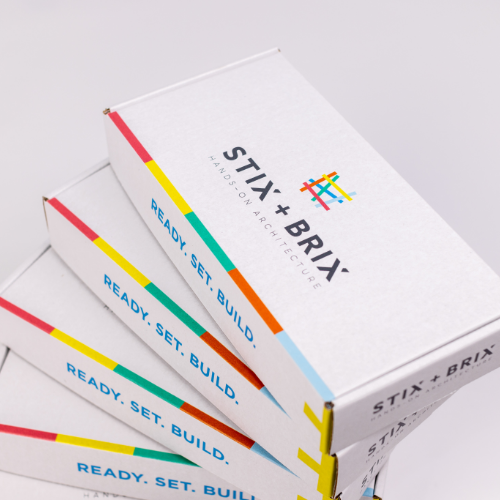
Take a look at some of the brands we have most recently brought to life on the consumer landscape. Remember, each product’s packaging is meant to communicate a purpose: what the brand stands for and what it means for their customer. Don’t miss this opportunity to create a lasting impression on the shelf and in the minds of your customers.
Remember, the key is to keep things simple. If you clutter your package, the consumer will never read your message let alone experience your product.


